Rebranding SwissDev: A Swiss construction company with a bold and elegant identity
Rebranding, a word that is music to our ears. A new logo, a new identity, and we’re set for a wonderful time. When a big construction company approached us with this request, we were buzzing to create something that stands out and reflects what this client is all about. And we did just that!
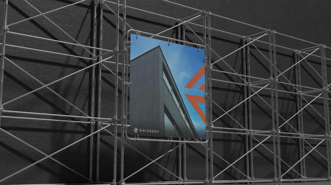
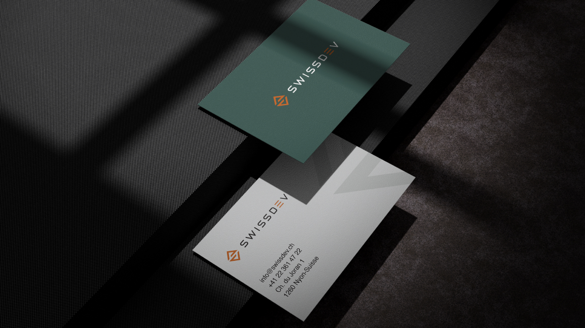
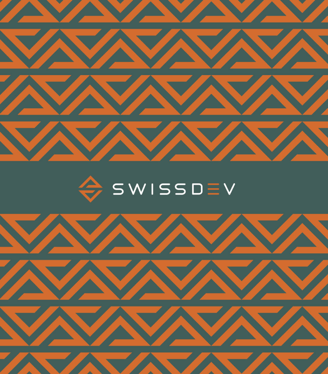
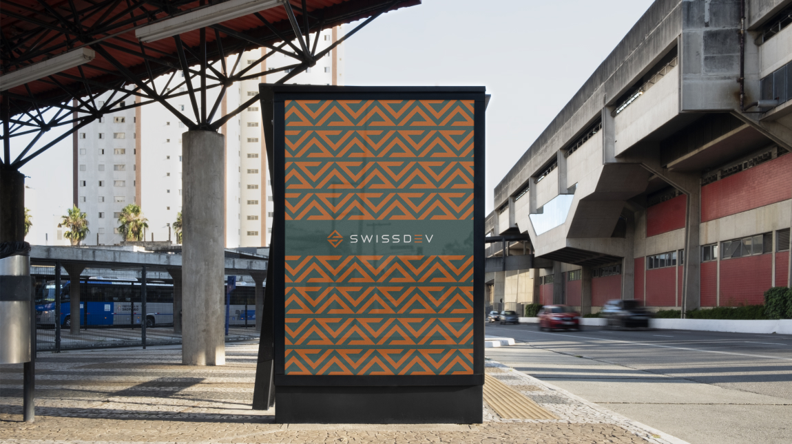
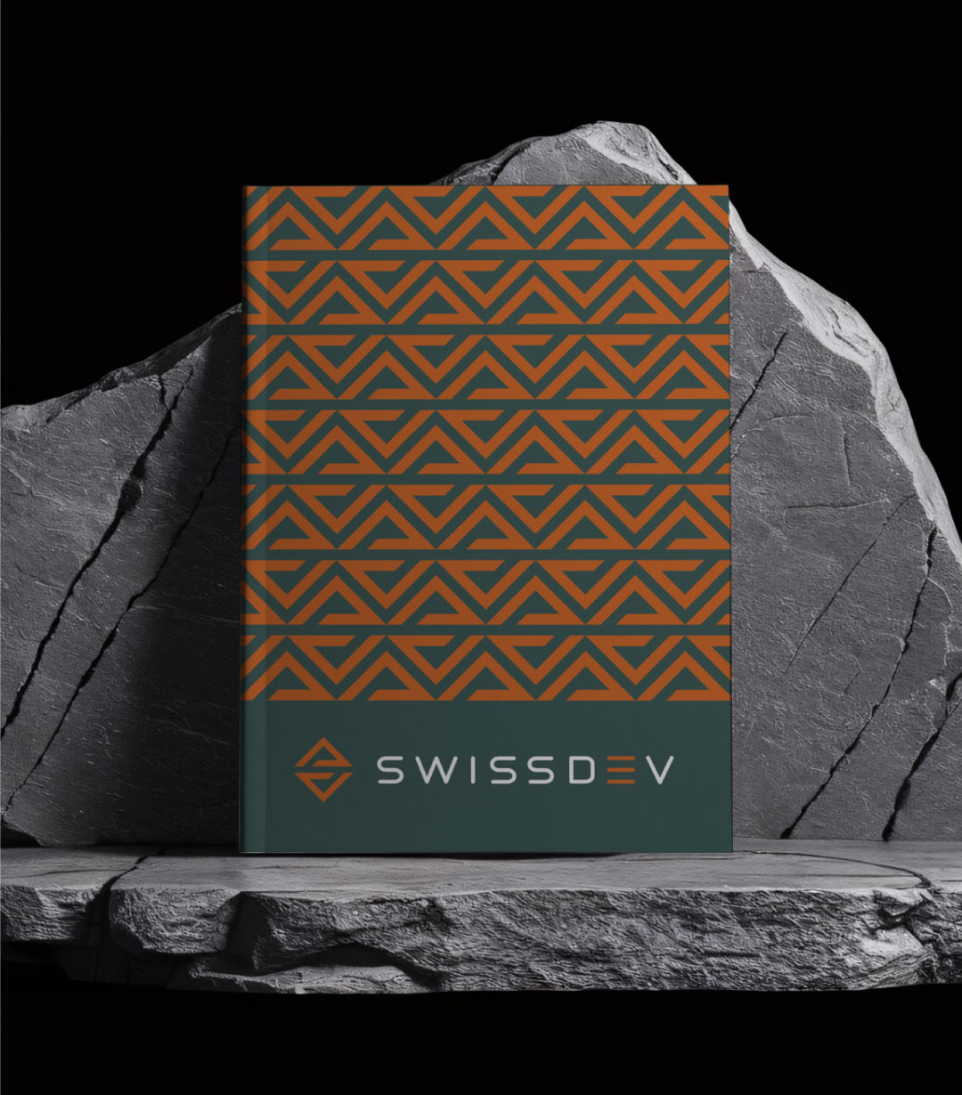
We worked with SwissDev, a construction company based in Switzerland, to completely refresh their visual identity and online presence. The project started with a full rebranding, including a new logo and a complete brand identity system that reflects strength, precision, and trust, traits that define SwissDev.
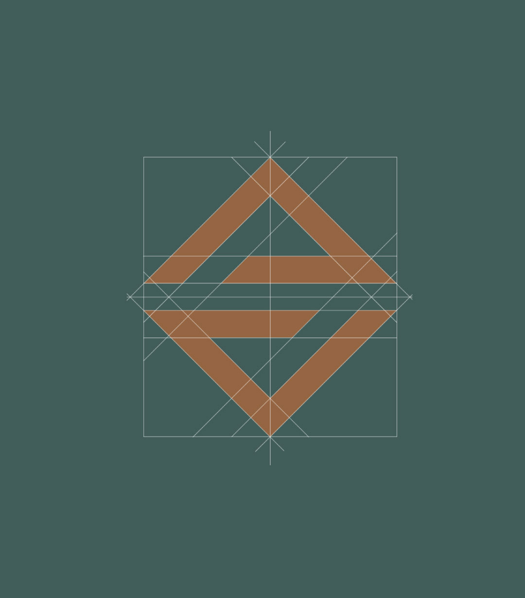
The new logo combines the letter “S” with the shape of a roof, symbolizing safety, stability, and clean architectural lines. This modern and minimal design reflects the company’s focus on building structures that last.
From brand strategy to visual design, we created a consistent identity that works across all platforms. The final result includes a clean rebrand that presents SwissDev as a dependable and forward-looking construction company.